The Oceans layer comes with a lot of other sublayers, including one from National Geographic about plate tectonics, earthquakes and volcanoes. Being a geology geek, I already have several volcano/earthquake layers from the Smithsonian, USGS, etc. So, I thought it might be interesting to compare the old and new offerings.
Here's the first - the Smithsonian Global Volcanism Program's catalog of Holocene volcanoes.

Then there's the USGS layers for earthquakes. (They don't seem to have a volcanoes layer, but they do have an interactive map of recent activity here). One EQ layer shows earthquakes by age (i.e., in the past hour, day, week, etc.), and the other by depth. I like the clean look of these, the small legend, and the information that pops up for each earthquake, complete with links to the USGS online record and
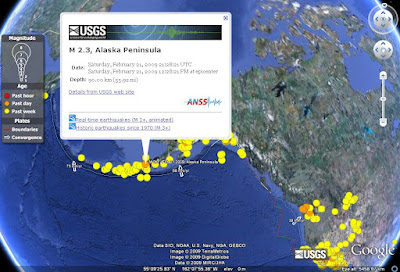 The most recent earthquakes are shown in red (hours ago), days-old earthquakes in orange, and months-old earthquakes in yellow.
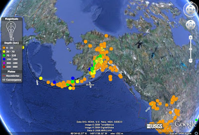 Here the shallower earthquakes are in red and orange, and the deepest are in blues and purples.
I like these because the symbols are easy to read, the legend is simple, and there's information about tectonic plate motions (including rates of movement) and boundary locations. The layers also updates themselves each time you open up Google Earth - very useful if you're teaching a class on plate tectonics, and want your students to keep track of earthquake activity in a particular area. You can even highlight specific types of plate boundaries, which are have their own separate sublayers.
The USGS has one more layer of historical earthquakes, with M3 in the past 90 days, M4 in the past year, and so on up to M9 (since 1970 - only one of these, the 2004 Sumatra earthquake).

Finally there's the new National Geographic plate tectonics layer. They went all out on this one - sublayers for plate boundaries, volcanoes, hot spots, earthquakes, plate motions...the whole shebang. It's actually quite crowded at first. Unfortunately, to download it you have to turn on the main National Geographic sublayer of the Oceans layer, search for the NG symbol in the middle of the Pacific Ocean, and click to download the plate tectonics bit. This is a major drawback for the NG information, and in the future I hope they list their information somewhere instead of making you hunt for it on the globe.

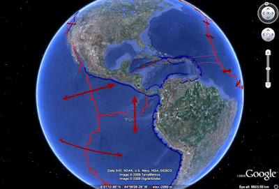 This one shows the plate boundary locations and types, and relative plate motions. Unlike the USGS layer, however, there's no information about rates of movement.
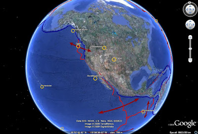 This view shows some of the "Selected Hot Spots". I'm a little iffy on whether all of the locations this layer shows are properly considered hot spots - there's a lot of argument about these phenomena anyway. The bad thing about this layer is that beside displaying the names, there's no pop-up info about these locations, nor is there any explanation of what a hot spot is.
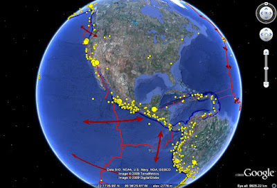 This view is showing the "Notable earthquakes since 1900" and "Quakes since 1900 greater than 6.5 magnitude" layers. Again, no information about the individual events, other than marking their location. I suppose it's useful for highlighting areas of high seismic activity, but it would be much better if there were at least magnitudes and dates listed for each event, so someone could look them up elsewhere.
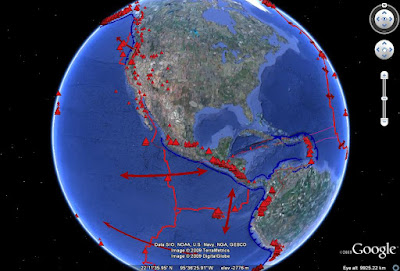 And, finally, the volcanoes - small triangles are Holocene eruptions, and large ones are eruptions since 1900. Yet again, there's no further information - this is where the Smithsonian layer outstrips the National Geographic one, despite its simplicity.
So what's the final verdict? Use all of them! I'd reserve the National Geographic layers for general overview - showing the locations of plate boundaries, eruptions and earthquakes, for example - but use the USGS and Smithsonian layers for more in-depth examinations. The USGS layer is especially good for teaching seismology and plate tectonics, since it gives information on plate motions and individual seismic events - and links it all to the USGS database.
I'm looking forward to reviewing new layers as I find them, and hopefully I'll get a chance to use them in my teaching.


9 comments:
Oooh, geology and Google Earth - right up my alley.
Will you be able to be on the PodClast tomorrow, Jess? I'd love to discuss this.
Absolutely! This would make a great topic for the PodClast.
Thanks for the great info! Very informative and detailed, and I'll be listening to the PodClast, although I haven't heard an announcement yet or know where it is.
The PodClast is back?
Yep - Podclast is on for today at 2000 GMT. There's info on how to join here - it's on Skype.
The "X in a box" means that the correct icon has not loaded. Not sure why that would be. Try using the built-in volcano layer (under Gallery) first, then see if the downloaded layer finds the icon.
nice. Im glad you put this up. I might not have ever found these.
This is a great blog, I came here from Geology.com. I am looking for the USGS photo of Volcan Chaiten to acompain an introductory chapter of a book on Chilean geography. Jessica, can you help me? All the best, Andres
Andres - The USGS Chaiten photo came from here: http://hvo.wr.usgs.gov/volcanowatch/2008/08_07_03.html
There is no higher resolution available on that webpage, but if you contact the webmaster for the HVO you should be able to find out how to get a better resolution image. You could also contact the photographer directly (jnmarso@usgs.gov) and inquire about using the image. Good luck!
Post a Comment